GroupBox QML Type
GroupBox provides a group box frame with a title. More...
| Import Statement: | import QtQuick.Controls 1.4 |
| Since: | Qt 5.1 |
| Inherits: |
Properties
- checkable : bool
- checked : bool
- contentItem : Item
- flat : bool
- title : string
Detailed Description

A group box provides a frame, a title on top and displays various other controls inside itself. Group boxes can also be checkable.
Child controls in checkable group boxes are enabled or disabled depending on whether or not the group box is checked.
You can minimize the space consumption of a group box by enabling the flat property. In most styles, enabling this property results in the removal of the left, right and bottom edges of the frame.
To add content to a group box, you can reparent it to its contentItem property.
The implicit size of the GroupBox is calculated based on the size of its content. If you want to anchor items inside the group box, you must specify an explicit width and height on the GroupBox itself.
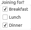
The following example shows how we use a GroupBox:
 GroupBox {
     title: "Joining for?"

     Column {
         spacing: 10

         CheckBox {
             text: "Breakfast"
             checked: true
         }
         CheckBox {
             text: "Lunch"
             checked: false
         }
         CheckBox {
             text: "Dinner"
             checked: true
         }
     }
 }
See also CheckBox, RadioButton, and Layout.
Property Documentation
checkable : bool |
This property holds whether the group box has a checkbox in its title.
If this property is true, the group box displays its title using a checkbox in place of an ordinary label. If the checkbox is checked, the group box's children are enabled; otherwise, they are disabled and inaccessible.
By default, group boxes are not checkable.
checked : bool |
This property holds whether the group box is checked.
If the group box is checkable, it is displayed with a check box. If the check box is checked, the group box's children are enabled; otherwise, the children are disabled and are inaccessible to the user.
By default, checkable group boxes are also checked.
[read-only] contentItem : Item |
flat : bool |
This property holds whether the group box is painted flat or has a frame.
A group box usually consists of a surrounding frame with a title at the top. If this property is enabled, only the top part of the frame is drawn in most styles; otherwise, the whole frame is drawn.
By default, this property is disabled, so group boxes are not flat unless explicitly specified.
Note: In some styles, flat and non-flat group boxes have similar representations and may not be as distinguishable as they are in other styles.
title : string |
This property holds the group box title text.
There is no default title text.