Using Layouts in Qt Designer
Before a form can be used, the objects on the form need to be placed into layouts. This ensures that the objects will be displayed properly when the form is previewed or used in an application. Placing objects in a layout also ensures that they will be resized correctly when the form is resized.
Once widgets have been inserted into a layout, it is not possible to move and resize them individually because the layout itself controls the geometry of each widget within it, taking account of the hints provided by spacers. Spacers can be added to the layout to influence the geometries of the widgets.
Layouts can be nested to form a hierarchy. For example, to achieve a typical dialog layout with a horizontal row of buttons, the dialog elements can be laid out using a vertical box layout with a horizontal box layout containing the buttons at the bottom. For an introduction to the Qt layout system, refer to Layout Management.
To break a layout, press Ctrl+0 or choose Break Layout from the form's context menu, the Form menu or the main toolbar.
Setting A Top Level Layout
The form's top level layout can be set by clearing the selection (click the left mouse button on the form itself) and applying a layout. A top level layout is necessary to ensure that your widgets will resize correctly when its window is resized. To check if you have set a top level layout, preview your widget and attempt to resize the window by dragging the size grip.
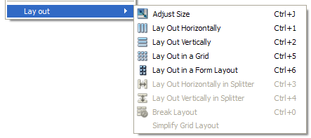
 | Applying a Layout To apply a layout, you can select your choice of layout from the toolbar shown on the left, or from the context menu shown below. |
Similary, top level layouts are set on container widgets (QGroupBox) or on pages of page-based container widgets (QTabWidget, QToolBox and QStackedWidget), respectively. The container widget needs to be selected for this to succeed.
Top level layouts are not visible as separate objects in the Object Inspector. Their properties appear below the widget properties of the main form, container widget, or page of a container widget in the Property Editor.
Layout Objects
Layout objects are created by applying a layout to a group of existing objects. This is achieved by selecting the objects that you need to manage and applying one of the standard layouts using the main toolbar, the Form menu, or the form's context menu.
The layout object is indicated by a red frame on the form and appears as an object in the Object Inspector. Its properties (margins and constraints) are shown in the Property Editor.
The layout object can be selected and placed within another layout along with other widgets and layout objects to build a layout hierarchy.
When a child layout object is selected, its parent layout object can be selected by pressing down the Shift key while clicking on it. This makes it possible to select a specific layout in a hierarchy, which is otherwise difficult due to the small frame.
Inserting Objects Into a Layout
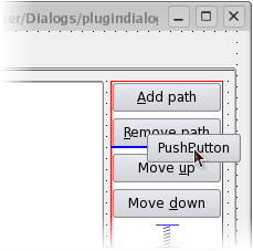
Objects can be inserted into an existing layout by dragging them from their current positions and dropping them at the required location. A blue cursor is displayed in the layout as an object is dragged over it to indicate where the object will be added.
Inserting Objects into a Layout
Layout Types
Horizontal and Vertical (Box) Layouts
The simplest way to arrange objects on a form is to place them in a horizontal or vertical layout. Horizontal layouts ensure that the widgets within are aligned horizontally; vertical layouts ensure that they are aligned vertically.
Horizontal and vertical layouts can be combined and nested to any depth. However, if you need more control over the placement of objects, consider using the grid layout.
The Grid Layout
Complex form layouts can be created by placing objects in a grid layout. This kind of layout gives the form designer much more freedom to arrange widgets on the form, but can result in a much less flexible layout. However, for some kinds of form layout, a grid arrangement is much more suitable than a nested arrangement of horizontal and vertical layouts.
The Form Layout
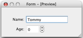
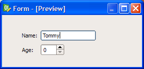
The QFormLayout class manages widgets in a two-column form; the left column holds labels and the right column holds field widgets such as line edits, spin boxes, etc. The QFormLayout class adheres to various platform look and feel guidelines and supports wrapping for long rows.
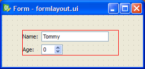
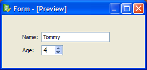
The UI file above results in the previews shown below.
| Windows XP | macOS | Cleanlooks |
|---|---|---|
 |  |  |
Splitter Layouts
Another common way to manage the layout of objects on a form is to place them in a splitter. These splitters arrange the objects horizontally or vertically in the same way as normal layouts, but also allow the user to adjust the amount of space allocated to each object.
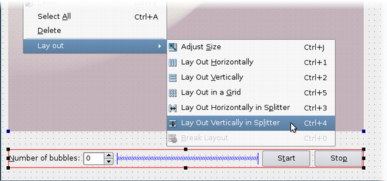
Although QSplitter is a container widget, Qt Designer treats splitter objects as layouts that are applied to existing widgets. To place a group of widgets into a splitter, select them as described here then apply the splitter layout by using the appropriate toolbar button, keyboard shortcut, or Lay out context menu entry.
Shortcut Keys
In addition to the standard toolbar and context menu entries, there is also a set of keyboard shortcuts to apply layouts on widgets.
| Layout | Shortcut | Description |
|---|---|---|
| Horizontal | Ctrl+1 | Places the selected objects in a horizontal layout. |
| Vertical | Ctrl+2 | Places the selected objects in a vertical layout. |
| Grid | Ctrl+5 | Places the selected objects in a grid layout. |
| Form | Ctrl+6 | Places the selected objects in a form layout. |
| Horizontal splitter | Ctrl+3 | Creates a horizontal splitter and places the selected objects inside it. |
| Vertical splitter | Ctrl+4 | Creates a vertical splitter and places the selected objects inside it. |
| Adjust size | Ctrl+J | Adjusts the size of the layout to ensure that each child object has sufficient space to display its contents. See QWidget::adjustSize() for more information. |
Note: Ctrl+0 is used to break a layout.